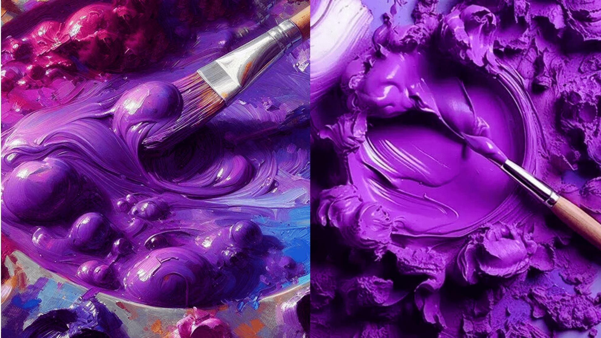
Introduction to the Color Purple
Making purple might seem straightforward—just mix red and blue, right? Yet, it’s a color that can be surprisingly tricky to perfect. The key to a vibrant purple lies in using the right shades of red and blue. Some guides and artists recommend specific shades for the best results, noting that the mixing process can be rewarding despite its challenges. For instance, a bright purple might require careful adjustment of the red and blue hues you start with, and adding white can help achieve specific shades of purple. It’s essential to use true primary colors for the mix to achieve the most vivid purple. Experimentation and practice are crucial as mixing colors is both an art and a science.
The Significance of Purple
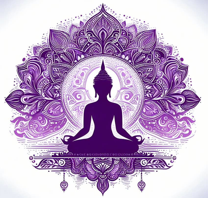
The color purple carries a rich tapestry of significance across different cultures and times. Historically, it has been associated with royalty, nobility, and luxury, largely due to the rarity and expense of the dye originally used to produce it. In Buddhism, purple symbolizes wisdom and spirituality, hinting at its deep and introspective qualities. The color also often represents mystery, magic, and even the divine, linking it to the higher realms of thought and spirituality. The varying shades of purple can evoke different emotions and meanings, but it consistently carry a sense of depth, dignity, and profound beauty.
Varieties of Purple
The spectrum of purple encompasses a wide range of shades, each with its unique character. Some notable examples include:
- Byzantium: A deep tone of purple, first named in 1926, embodying richness and depth.
- Dark Orchid and Violet: Offering a vibrant intensity that’s both eye-catching and elegant.
- Magenta and Indigo: These colors blend the warm and cool ends of the spectrum, creating dynamic and vivid hues.
- Lavender Blush: A soft, ethereal shade perfect for creating a light, airy ambiance.
- African Violet and Amethyst Purple: These shades bring a natural element to the palette, echoing the beauty of flowers and gemstones.
From the regal and profound to the light and whimsical, the various shades of purple offer a versatile palette for designers, artists, and enthusiasts alike.
The Basics of Color Mixing
Understanding the fundamentals of color mixing is essential for artists and anyone interested in exploring the vast possibilities of color. Here’s a concise guide:
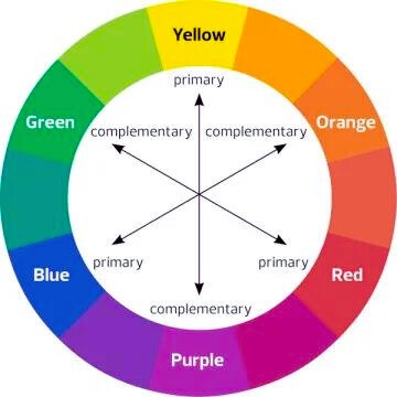
- Primary Colors: Red, blue, and yellow are the primary colors. They serve as the foundation for creating a wide range of other colors and cannot be made by mixing other colors.
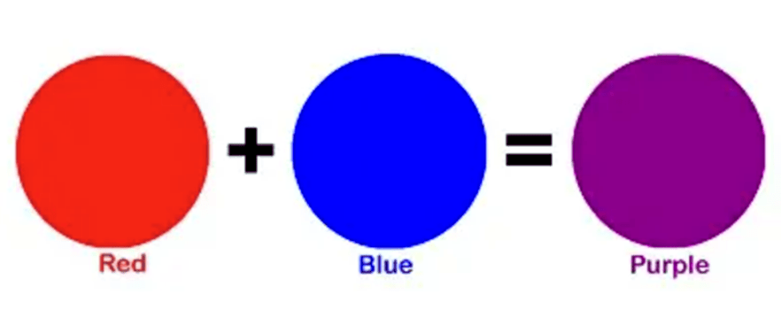
- Secondary Colors: Mixing two primary colors in equal parts yields secondary colors. Red and blue make purple, blue and yellow make green, and yellow and red make orange.
- Tertiary Colors: These are created by mixing a primary color with a neighboring secondary color. For example, mixing blue (primary) with green (secondary) creates blue-green (tertiary).
- Understanding Color Value: Adding black or white to a color can darken or lighten it, respectively, altering its value and creating shades (darker) or tints (lighter) of the original color.
- Color Temperature: Colors can be categorized as “warm” (reds, oranges, yellows) or “cool” (blues, greens, purples), influencing the mood and perception of a piece.
- Mixing Tips: Practice and experimentation are key. Start with small amounts when mixing colors to avoid waste and gradually adjust until you achieve the desired shade.
Understanding Primary Colors
Primary colors are fundamental because they serve as the base from which all other colors can be created but cannot be formed by mixing other colors. The significance of primary colors lies in their role as the building blocks for the color spectrum used in various color models. There are three main models of primary colors used across different mediums:
- RGB (Red, Green, Blue): This model is used for light-based colors, such as those on computer screens and televisions.
- CMY (Cyan, Magenta, Yellow): Primarily used in color printing, this model forms colors through the subtractive color process.
- RYB (Red, Yellow, Blue): Often taught in schools and used in art and design, this model is traditional for mixing pigments like paints.
Each model uses its set of primary colors to mix and create a wide range of secondary and tertiary colors, making understanding these foundational colors essential for anyone working with color in any medium.
The Role of Light in Color Perception
The perception of color is profoundly influenced by light, which acts as a crucial variable in how we see colors. Light sources, objects, and the receiver (the eye) interact to shape our color perception. The color we perceive is essentially the frequency of light that is reflected to our eyes, while other frequencies are absorbed. This interaction determines the color appearance of objects under different lighting conditions. For instance, an object may appear differently under sunlight compared to artificial light due to the light’s color temperature, and intensity. Research by NIST on LED lights has shown that different light sources can significantly affect our color perception, potentially leading to new standards in lighting to ensure color accuracy. Additionally, experiments have demonstrated that objects do not reflect certain frequencies of light, resulting in them appearing black under specific lighting conditions, which further emphasizes the critical role of light in color perception.
Step-by-Step Guide to Making Purple
To mix a vibrant purple using acrylic paints, follow these steps:
- Choose Your Colors: Start with shades of blue and red. The exact shades can affect the final purple, so experiment to find your preferred combination.
- Mix Blue and Red: Combine blue and red paint in equal parts. Adjust the ratio depending on whether you want a cooler (more blue) or a warmer (more red) purple.
- Adjust the Shade: If your purple isn’t vibrant enough, consider adding a tiny bit of pink or more red to brighten it. You can also experiment with adding a small amount of white to lighten the shade without diluting its intensity.
- Fine-Tuning: Remember, the type of blue and red used can create various purples, from deep violet to light lavender. Experiment with different combinations to achieve the desired result.
Creating Different Shades of Purple
Light Purple

To create light shades of purple, such as lavender, start with the basic purple mix and then modify it:
- Mix Basic Purple: Combine red and blue in equal parts to make a basic purple. Adjust the ratio if you want a cooler (more blue) or warmer (more red) base purple.
- Lighten the Purple: To create a lighter shade, such as lavender, gradually mix in small amounts of white paint. Start with a little and add more until you reach the desired lightness.
- Fine-Tuning: If the light purple is too dull or not the exact hue you’re aiming for, consider adding a tiny bit more red or blue to adjust the color temperature. Remember, adding colors gradually is key to achieving the perfect shade.
Dark Purple
To create dark purple shades, you can follow these steps:
- Base Mix: Start by mixing equal parts of blue and red to create a basic purple. Use a dark shade of both colors for a deeper base.
- Darker Shades: For darker purple, use more blue than red. Darker blues contribute to a deeper purple. Consider using Turquoise Blue for cooler, deeper shades without leaning too much into black.
- Adding Depth: Without adding white, purple paint tends to be dark. Layer it to increase darkness without diluting the color.
- Fine Tuning: To darken the purple further, you can mix in a small amount of black. Be cautious; too much black can overwhelm the purple. Alternatively, mix complementary colors (like a small amount of yellow for violet/purple) to darken without losing vibrancy.
Tips for Perfect Color Mixing
To achieve perfect color mixing, consider these pro tips drawn from various artists’ experiences and studies:
- Experiment and Learn: The journey to mastering color mixing is highly personal. Experiment with different colors and learn the combinations that work best for the results you desire.
- Understand Pigment Qualities: Each paint has unique pigment qualities. Understanding these can help you consistently achieve the exact color you’re aiming for.
- Basic Color Theory: Familiarize yourself with basic color theory, including primary, secondary, and tertiary colors, as well as complementary and analogous color schemes. This knowledge serves as a solid foundation for effective color mixing.
- Pro Mixing Tips: Learn from professionals by incorporating their mixing techniques, such as understanding the role of white in lightening colors without diluting their saturation.
- Practice Regularly: Color mixing is a skill that improves with practice. Regularly challenge yourself with new combinations and techniques to refine your ability.
- Using Black Wisely: Be cautious with black; it’s powerful and can dominate other colors easily. Learn how and when to use it to enhance rather than overpower your palette.
Common Mistakes to Avoid
When mixing colors, especially to achieve vibrant purples, here are some common mistakes to avoid:
- Wrong Color Bias: Using a red that leans towards yellow can lead to a dull or brownish-purple. Choose a red with a blue bias for a vibrant purple.
- Using the Wrong Red: A common mistake is using the wrong shade of red as the primary color. Opt for a more appropriate shade that leans towards blue to get a rich purple.
- Improper Balance: To darken purple, adding the correct color in the right proportion is crucial. For a reddish-brown hue, start with a reddish-purple and incrementally add yellow.
These tips can guide you to more successfully mix colors and achieve the vibrant or specific shades of purple you desire.
Conclusion
And there you have it—a guide to making the perfect purple. Whether you’re an artist, a DIY enthusiast, or just someone curious about color theory, I hope this guide sparks your creativity. Remember, the journey of mixing colors is as rewarding as the outcome. So, dive in, experiment, and don’t be afraid to make mistakes. After all, every masterpiece starts with a single brushstroke.
Read also: What Features Are Included in Our Camon 20 Series?
FAQs
Q. Can I make purple using other colors?
Yes, you can experiment with different hues of red and blue to create unique purples. However, primary red and blue are your best bet for a vibrant purple.
Q. Why does my purple look muddy?
This usually happens when the paint is over-mixed or too much black is added. Start over with fresh paints and mix gently.
Q. Can I make purple without blue?
Traditional purple requires blue, but you can create similar hues by mixing red with colors like cyan or magenta, depending on the paint types you’re using.
Q. How do I make a neon purple?
Use fluorescent or neon red and blue paints, or mix a bright purple with a small amount of white to increase its vibrancy.
Q. Does the brand of paint matter when mixing colors?
While the basic principles of color mixing apply across brands, different brands may have slightly different formulations that can affect the final hue. It’s always a good idea to test colors from the same brand for consistency.